Design
Animation
Objects
Fashion
Poster Design
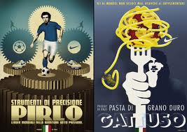
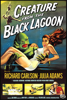
The most obvious parts of the 1950's style is that the designs are striking colours and big bulky shapes, stands out from the crowd. There is already a lot of evidence that works out the retro colour rules and what shapes best depict the period. Some of the poster design uses strong use silhouttes, which is a great reference because we were planing using alot of shadow silhouttes to suggest other characters and where the spiders are but maybe instead of pure black maybe try some different blue shades or white. I am going to look further into animation of this time to analyse film based techniques that could also bring forward.


No comments:
Post a Comment