Hi Alan, the labels to check through this time are:
Models and Metaphors
Models and Metaphors MAYA

Showing posts with label Models and Metaphors. Show all posts
Showing posts with label Models and Metaphors. Show all posts
Monday, 28 May 2012

Sunday, 27 May 2012
Previz Re-edit
It wouldn't let me add my sound effects in Movie Maker so I simply just changed the ending so that it just appears on and flows better as an ident.
Wednesday, 23 May 2012
Time Travel Transitions for the four appearing Logos
I read Alan's comment and he suggested quickly putting up transitions of how each 'time travel' would work so taking and editing the render versions (most current look for logos) I tried to do this.


Playblast of early animation
I know I wasn't neccessarily meant to worry about the animation this time, I wanted to try something so have animated the fire and first arrival, I tried to create the impression of the logo building up with turning bits off and on and it is very quick as there has to be enough time for the rest to appear but I would play around with timing more and finish this if I had more time but for now it is a start.
Final Renders
Now the scene has been set up I brought the logos in to produce a bunch of finished renders as well as a group shot at the end to look at scale and positions.


Previz with Sound Examples
I have a variety of sounds that could be used to drive the animation, bascially a sound for each arrival, the fire and the crash of the future logo at the end.
The sounds for the steam, fire and wood construction came from http://www.freeSFX.co.uk
The sounds for the steam, fire and wood construction came from http://www.freeSFX.co.uk
Tuesday, 22 May 2012
Final Textures and Lighting
I had a lot of help from Alan the last couple of days to refine the textures and lighting. I have learnt and realized useful tips to create highlights and to really advance from to more detailed textures.


Monday, 21 May 2012
Channel Sting Previz
As I had all components modelled and useable, I decided to construct a previz version of what the Sting/Ident could look like as time is running out and this gives a glimspe of the set up. The camera, I placed slightly off centre to make the view more interesting than dead straight. I am still not sure where to place the logos as the renassaince one is slightly harder with it's wings. I took Alan's advice about simple on and off key frames as a basic arrival, the future one may be off screen but the sound will be recognisable before plunging and crushing the other logos. I created simple particles for the fire to remain right until the future logo's dramatic entrance.
In terms of timing, I roughly want each arrival to be two seconds so that there is enough time for the effect and each logo to appear. The future logo will be quicker as that is just a fall. I may decide to make the logo at the end longer as one second might be too fast to take in and that is the important part announcing the 'themed' week.
There is no sound at this stage because although I have music samples I could use, I think I now need sound effects to drive it forward but I need to research and found the right ones for each arrival and the fire crackling.
Future Logo UV's and Texture
This was hard to match up and I might have to work back into some areas if there is time but happy for now.


Sunday, 20 May 2012
Prehistoric Logo UV and Texture
I used the same rock texture that I used in the concept and painted the loin cloth texture based on it.


Renaissance Logo Uv's and Textured
Created Texture maps for the planks and wings and Materials X for the rest of it as these will appear small in the camera anyway but I like that some parts are more textured while others are simple as this will work in the animation.


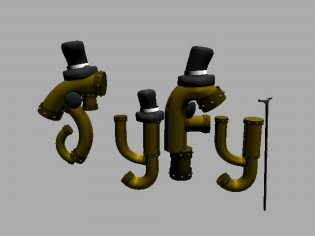
Victorian Logo Textured
I have textured the logos props so this one is finished, I downloaded the velvet texture that Alan suggested to use for the hats and the rest are various settings in materials x.
Prehistoric Environment Modelled
The composition is based on the final concept and the camera angle in the second image is roughly what I want and will edit this if needed when I bring the logos in and work it out fully. The rocks I made similarly to the prehistoric logo so that it feels part of that world. The trees and sticks were made with the simplistic style in mind as portrayed in the concept where I shall apply texture to.


Prehistoric Landscape Concept
I took Alan's advice and used guides to place things within the environment, staging a central spot for the logos to appear. I have also added more detail and defined a horizon line.

Future Logo Modelled
I changed the shape to incoporate more of the 'v' design that Star Trek used and to make it distinctive against the present logo to show how it might change. I have given the spock 'Y' the phaser so that each letter has an item of some kind and balance it out.


Future Logo Concept 2
I had to change this one completely as the other was too fantasy based, so Alan suggested 'Star Trek' as the approach to take and dressing each letter as a member of the crew. Also to incorporate a sense of clean and pristine colours to used future instead of fantasy art.

Saturday, 19 May 2012
Prehistoric Logo Modelled
I used Sculpt Geomentry as was suggested by Alan to create the rocks (I quickly laid out the UV's for them before doing this) and I found a tutorial for draping cloth over a model using N Cloth which I adapted and changed to suit what I needed.

Model Update Renaissance Modelling 2
I have redone the Renaissance Model as it had similar issues to the Victorian one of following the concept shape instead of individual planks of wood, gears, etc. I noticed in some images the wings have been cloth - like so that was what I aimed for in this version and felt it would brake away from the rest of the wooden forms of the logo. I made various planks, nails and a water wheel to construct into the logo.

Subscribe to:
Posts (Atom)